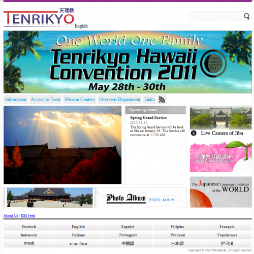
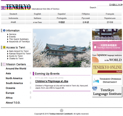
The Tenrikyo International Website has, once again, been updated with a new interface. The bloated language bar is now at the bottom of the page and they have included an over-sized rotating banner at the top of the front page. It’s so dominant that it seems to be the banner of the entire site.
The website, same as before, uses WordPress (like this website) and seems to just be focused on filling in the basic content in the many languages it supports. Hopefully, they will implement news from the Tenrikyo Newsletter, so we can all keep up with the news digitally.
tenrikyo.jp
FYI, you can access the website with the “tenrikyo.jp” domain name without the “.or” for less painful keystrokes. I’m not sure when this change had occurred, but it’s just a small convenience. This is also applicable to their email addresses. It’s just cleaner.
Hit the jump for an image of the old website.


